
Tuesday 21 December 2010
Friday 17 December 2010
Content Pages
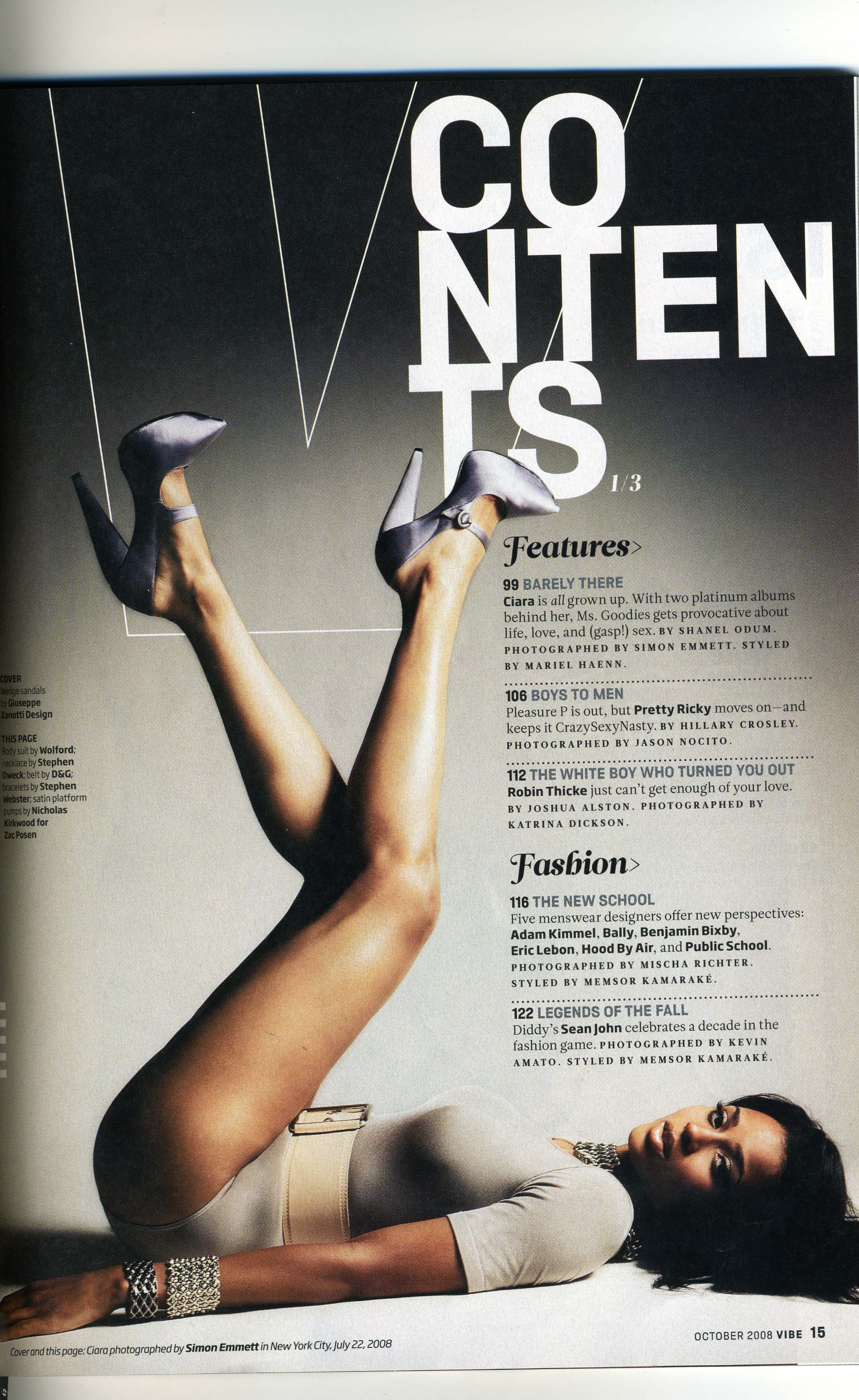
This magazine is targeted at people, mostly women, that are interested in fashion. The content header is original and different to other magazines that normally have is at the top, straight. However this magazine has words on different lines which makes its more unusual to the audience, which could attract them. Some of the words such as 'features' and 'fashion' are bigger and bolder - to pull the target audience in with this key words about the magazine is about. The set colours for this page and calm and neutral; black, white and cream., although i do find this page bold. However the creams and whites quiet the feel down.


This magazine is targeted to extreme sports people, such as snowboarding which is shown from the remarkable pictures above. The content title fits in with the images and create and simple clear heading. The colours in this contents page are white, black and pink, yet these do not create a bold feel; the colours are more cool and calming. The images are clear and take up most of the double page spread, this could be to keep the audience interested in the magazine and make every page relevant to the target audience. The text is quite small and is all put together to make it easier for the reader which i think is better than having text all over the images, because they would just spoil it. The text is nothing fancy, just plain and simple which i think works best with this magazine.
Tuesday 14 December 2010
Magazine Research continued...

This double page spread, although it is from the Internet, is from a 'Amelia's Magazine'. This magazine uses sketches of images throughout the pages as apposed to actual photographs or pictures, although it does contain them also. I find this unusual and unique to a magazine which influences me. The colours used on this page spread are mainly purple, blue and crimson. These colours are bright and stand out, yet because the colours contrast well together it makes the page more calmer and not so bold.
The writing and information is clear and well organised so people can see what they are looking for or to catch their eye.
Front Covers

Colours
I think these bring colour to the magazine front cover and catches people’s eyes to attract them to the magazine.
I think these bring colour to the magazine front cover and catches people’s eyes to attract them to the magazine.
Information
The information is clear and the simple font in the black stands out against the bright background and clear part of skin on the picture of Rihanna.
There is less writing on the cover compared to other magazines this because I think that the editors didn’t want to cover up all the bright colours on the magazine or to make it different to other magazines.
Mast Head
I like the font of the mast head as in blends in with the background yet you can still see the title clearly as well. The font is like a scribble which creates a ‘rushed’ effect to the magazine, yet it gives the magazine the sense of style.

Mast head
The masthead on this magazine is at the bottom of the cover page, which is very unusual for a magazine. The font that is used is similar to a newspaper, which conects with the title 'the New York Times Magazine'. This gives a simple clear effect the the cover.
Images
The images to this cover are very eye catching towards a veiwer. This is because there are so many differnet images that show a variety of people. The photos also seemed to be editing in some way to make the magazine stand out and differ from other front covers.
Colours
The main colours are black and white, yet there is a a bright wash of colour coming through the pictures. The pictures look to have been washed to make them lighter and not so bold, to creat a calm effect. This technique is simple, yet effective to the reader.
Coverlines
There is not much extra information given on the cover which could be could be an advantage to the magazine or a disadvantage. The advantage being people will be attracted to the magazine cover therefore wanted to buy the magazine to see what is inside. Although the advantage being that people will not know enough want the magazine is actually about and what is inside it,, so then they would not purchase the magazine.

This is an example of Amelias' Magazine front cover. It has a vintage vibe to it, due to photo editing and enhancement. This magazine had no main masthead, although it has mainly coverlines that are in black to keep the cover simple. This works well, as the picture takes up the entire page with colour, so having a variety of colour text would probably spoil the simplicities of the image.
Subscribe to:
Posts (Atom)