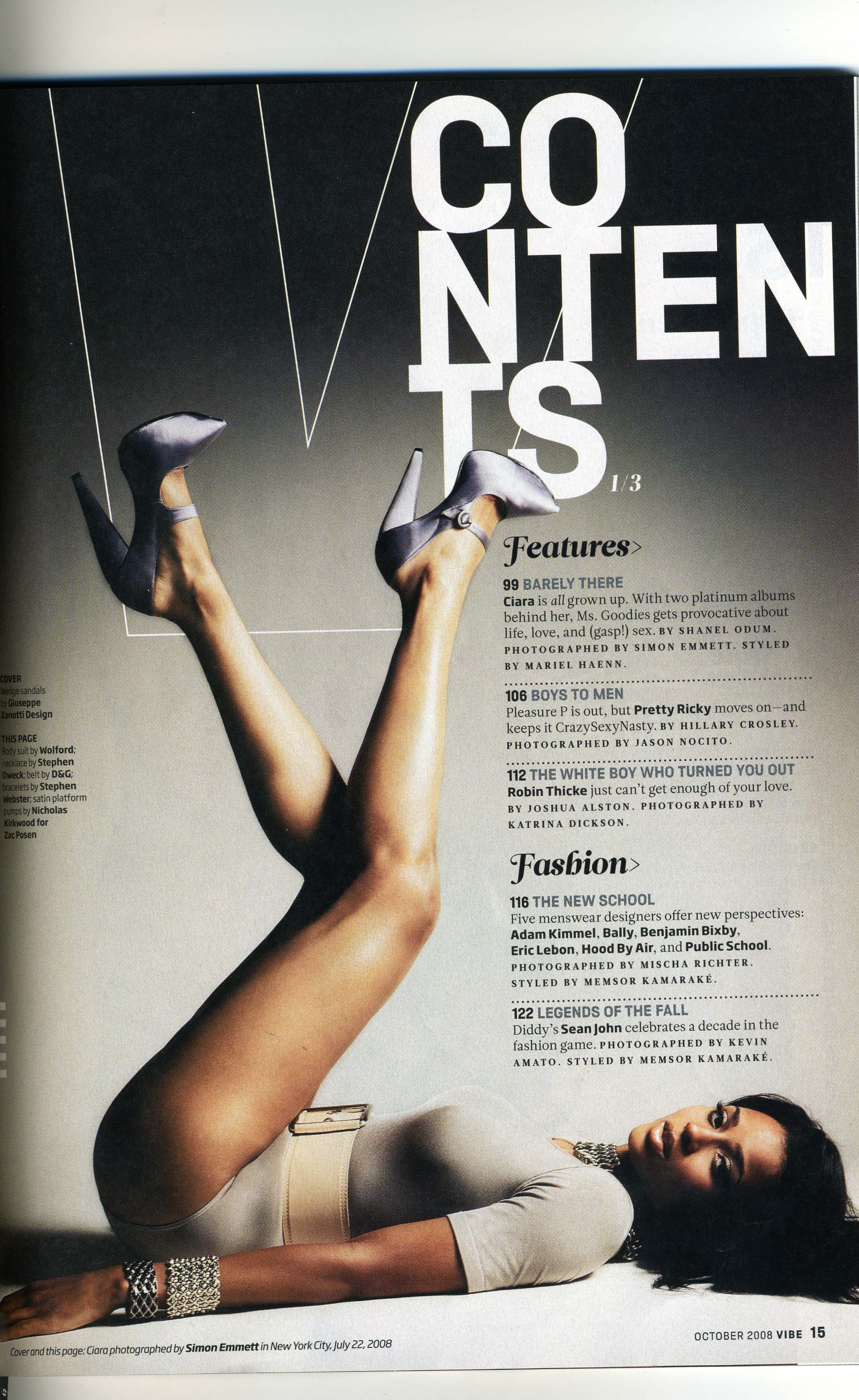
This magazine is targeted at people, mostly women, that are interested in fashion. The content header is original and different to other magazines that normally have is at the top, straight. However this magazine has words on different lines which makes its more unusual to the audience, which could attract them. Some of the words such as 'features' and 'fashion' are bigger and bolder - to pull the target audience in with this key words about the magazine is about. The set colours for this page and calm and neutral; black, white and cream., although i do find this page bold. However the creams and whites quiet the feel down.


This magazine is targeted to extreme sports people, such as snowboarding which is shown from the remarkable pictures above. The content title fits in with the images and create and simple clear heading. The colours in this contents page are white, black and pink, yet these do not create a bold feel; the colours are more cool and calming. The images are clear and take up most of the double page spread, this could be to keep the audience interested in the magazine and make every page relevant to the target audience. The text is quite small and is all put together to make it easier for the reader which i think is better than having text all over the images, because they would just spoil it. The text is nothing fancy, just plain and simple which i think works best with this magazine.
No comments:
Post a Comment