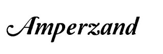
For my font I want a simple and clear title that is also eye catching. The fonts above are all fonts I found suitable for the magazine. The one I dislike the most is the second one down (Caffeme Blackout) because I found it to different for the genre of music that i wanted for my magazine. Although the font is unique I do not think it will work well with my magazine. One of my favorite fonts is the last one ( Maragarosa) which i think is quite good as it look hand written but is not messy. Also the one above this (Hand Of Sean) is similar to the bottom font. These two, I think would work well for my genre of music.


No comments:
Post a Comment